By Asiyih Linz, Marketing Manager, Second Sight Design
You’ve been looking forward to this all week. A chance to disconnect from the blue light of your work screen and connect with the ones you love. There’s no better way to do so than by sitting down for a couple of intentional, uninterrupted hours of conversation over dinner at your favorite restaurant.
You and your party are seated and a sticker on your table instructs you to pull out your phone to view the menu. You look around and realize that every table either has a guest holding their device or has a device sitting next to them on the table. Instead of people engaging with each other they’re instead looking down, glued to their screens. Phone lights are going off with notifications throughout the restaurant. People are clicking away. The anticipated scene bursting with human-to-human connection is lost and you wonder how and when did the landscape of dining change?
This might be an exaggerated, dramatic telling of a dystopian restaurant scene, but it’s hard to overemphasize the intrusion that phones can play on a dining experience. What was once considered a faux pax whilst dining with company has gotten a major pass due to the intensified need for contactless options during the height of the pandemic. As restaurants navigated uncertain times, they looked for ways to reassure guests that they were taking Covid protocols seriously. A common approach was employing QR codes to view web menus on their phone in lieu of touching a potentially germ-infested physical one. While we now know it’s unlikely Covid can be transmitted from surfaces — and other high touch items like condiment bottles, which are back on tables — some restaurants have chosen to keep the QR code option available to guests either as the sole means of menu viewing or in addition to an in-hand version.
Beyond the consideration that QR codes give to cautious guests, they also benefit the restaurant by cutting out printing costs and allowing for daily specials and last minute menu changes. And with that, phones have become the newly socially acceptable “plus one” at everyone’s table.
With the rise of social media and influencers, we can’t entirely blame the phone focused dining shift on QR codes. This trend has been on the rise for a while as guests often will snap a quick shot of their dish before even having a bite, sometimes even documenting every course while posting and captioning in real time. But as we’re increasingly accepting this shift and promoting it to our guests, have we considered what we are losing?
Although QR codes may make a restaurateur’s life easier, guests overwhelmingly prefer paper menus. A recent Technomic survey found that about 88% of respondents said they preferred paper menus to digital QR codes and about 66% of respondents agreed or strongly agreed that they didn’t like QR codes because they involve pulling out your phone as soon as you sit at the table. (source: CNN.com)
Besides negative guest sentiment, restaurateurs lose out on an important guest touchpoint when they transition to QR codes. The “science” of menu design plays an integral role in the dining experience. The moment a guest walks through the door, a restaurant prepares a journey of surprise and delight and should jump at every opportunity to better communicate its brand story. From the choice of paper color, size and weight to its layout, illustrations, and use of eye movement patterns, there are specific decisions made throughout the design process to capture the guest and draw their attention while thoughtfully leading them through the restaurant’s identity.
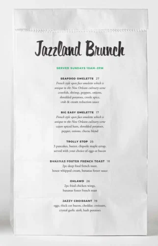
Second Sight Design (SSD) prides itself on creating menus so delectably designed you can almost taste it with your eyes. When Q and A in Oceanside, California requested brunch menus, they set out to create one that would match the energy of the city the restaurant was inspired by. By printing on white paper bags with illustrations and typography reminiscent of the beignet sacks from Café du Monde commonly seen in the hands of locals and tourists alike walking the streets of New Orleans, they captured the essence of the brand to create a memorable visual experience for the guest just short of being in the lively city.
When it came to creating their dinner menus, Second Sight sourced handmade leather books by local artisan, Bryer Made, to emphasize the transition to Q and A’s upscale evening dining experience. The pages within the thick weight of this beautiful menu book were thoughtfully layered to add dimension and a storybook feel while also highlighting the oysters, the restaurant’s most coveted item. The brand tale continues with NOLA landmarks and taglines decorating the menu pages.
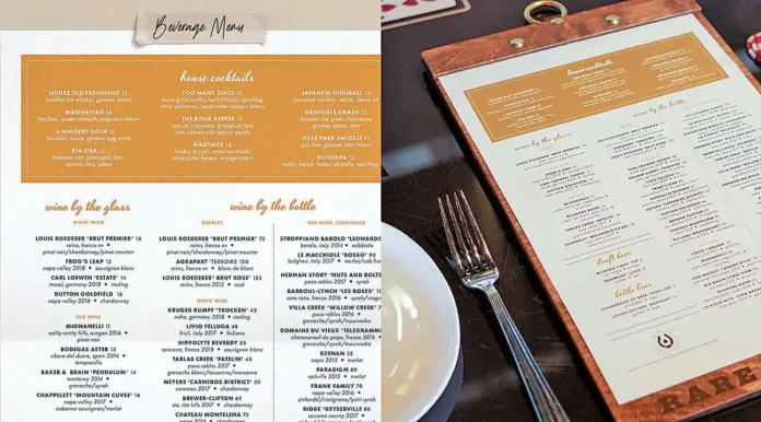
While working with Rare Society in San Diego, the SSD team leaned into the nod to old school Vegas interiors of the restaurant when designing the dinner menus. Using layouts and typography pulled from vintage Vegas super clubs like The Copa Room at The Sands and Versailles at Riviera, a guest’s eyes are subtly transported back in time while scanning for their delicious selection. The back side of the menu continues the brand story by mimicking artwork on the back of a playing card, arguably the most iconic feature of a casino.
But even if a visual experience isn’t important to a restaurant, their bottom line certainly is. When designing a menu layout, the delicate decisions on the use of white space, boxes or colors can help attract eyes to high ticket items. For JRDN, SSD used yellow markups mimicking chef’s notes to draw attention to the Lobster BLT, Jumbo Sticky Buns and Avocado Toast, the restaurant’s most profitable items on its brunch menu.
Although one could argue that web PDFs still allow a restaurant to showcase an element of its menu design, because ADA accessibility is a top priority and phone sizes are limited, they aren’t optimal for web viewing. To avoid making guests endlessly pinch and zoom in on their screens, restaurants often must end up opting for a generic template of tabbed sections of one column scrolls to display their menu. Either way, you can’t replicate the feeling of importance of holding a menu so thoughtfully tied into the aesthetic of the restaurant has on the overall guest experience. While cost and safety will always be valid considerations that restaurants must weigh when executing their overall vision, we hope they don’t lose sight of the value that in-hand menus can play on the overall magic of a distraction free dining experience.
Learn more at https://www.findsecondsight.com/


